the importance of casting vision & finding your fonts
When I decided to overhaul my brand - by myself - I felt confident.
“This should be easy,” I thought.
I love aesthetics, design and studying typography. I knew the vibe I wanted, and what I wanted my clients to feel and experience. I could see it clearly.
However, when I was in my, “this is a great idea, Erika!” thought bubble, I must’ve had a brain fart of WHO I ACTUALLY AM - which is a perfectionist. Instead of it taking a couple weeks, it took me months but I’m beyond proud of what I’ve created. In the process, I realized the whole journey of conceptualizing a brand and executing it is a bigger passion of mine than I originally thought.
It isn’t easy when you don’t know where to start and can’t decide if you want to hire someone. I suggest you do hire someone if you don’t have the time or brain space to do it on your own. Either way, you still need to know the basics. It will clear the lines of communication when you’re developing your brand with a designer and result in something more accurate & authentic. Because of my unnecessarily long journey of doing it on my own, I wrote a complete guide to help you imagine your brand… hopefully in less time than it took me. Keep your eyes peeled because it’s coming soon!
For now, I wanted to give a little behind-the-scenes of the process of selecting my fonts.
When you choose a font, it should communicate - at first glance - something compelling about your brand. Different fonts evoke different emotions. They can communicate anything from playfulness & wonder, to seriousness & dominance, etc. Fonts instantly demand a response that is often subconscious. Choosing the right one(s) will give you the opportunity to connect the dots between who you are as a brand and how you articulate it out into the world. Since each font gives off it's own vibe, pairing them together wisely can be a smart way to curate an intentional experience for the viewer.
*Fonts used: H2, Body and H3 are all Monsterrat. H1 is Playfair Display.
Font hierarchy refers to presenting your content in a way that visually conveys where to look, and in what sequence. Size, color, position, weight, spacing, and which fonts you choose will either help or hurt your font hierarchy and subsequently, your viewers experience. Those are just some of the attributes you can experiment with to create typographic hierarchy. The right combination will give your content a whole new look, make section headings pop and help guide your readers’ eye through the page.
Side note - did you know a “typeface” is a family, and “fonts” make up the family? For example - Helvetica is a typeface. Helvetica Regular, Bold, Italic, Thin, Hairline etc are the fonts within that family. In my guide, I cover font families, as well as break down each different font style, like serif and sans serif, and what they communicate. I also go more in-depth into typographic hierarchy and how understanding the importance of all components of your content is essential in avoiding visual fatigue for the viewer.
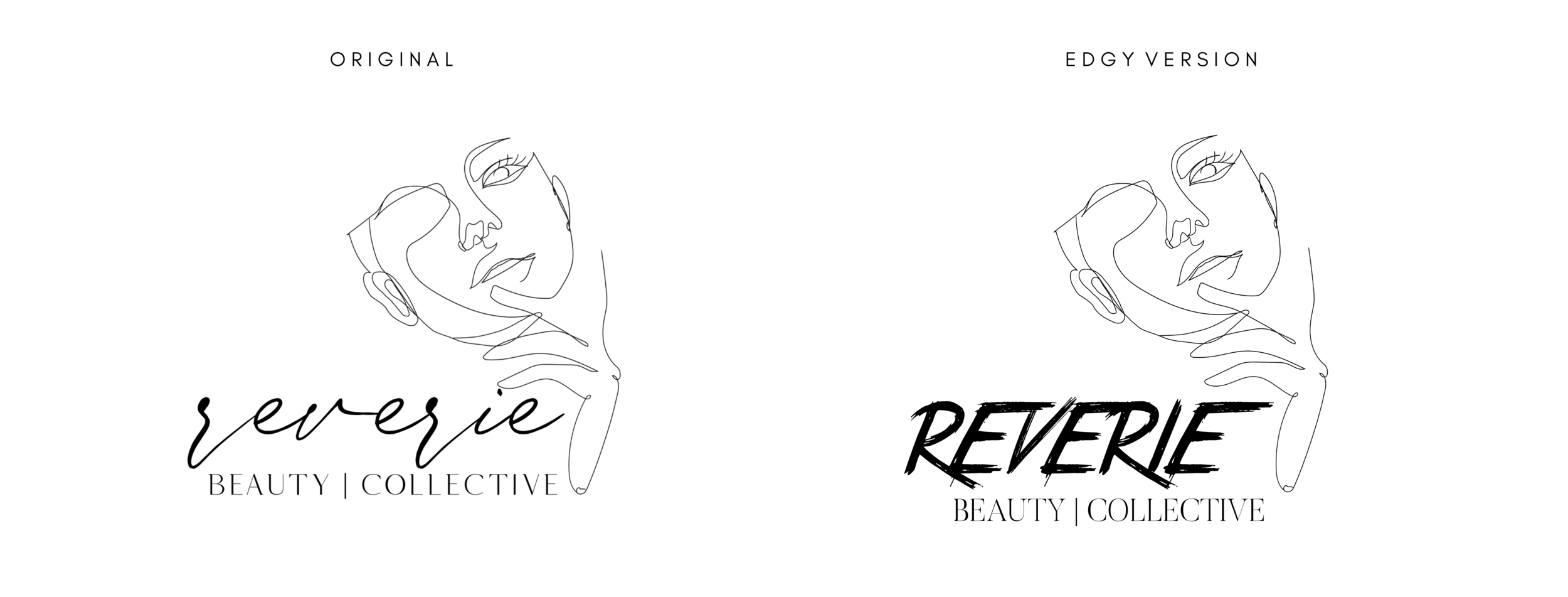
With the name of my business beginning with the word “Reverie,” I knew I wanted my logo & heading font to be ethereal. A clean, handwritten flowy font is what I set my sights on. I looked at a few dozen before I ended up buying the one you see. I wanted my secondary typeface and subheading font to be a little more bold, a little more Vogue, but still in the classic, sophisticated vein. For my paragraph or body font, I wanted a sans-serif that was clean and not a distraction. Choosing your font pairings with careful thought and intentionality will help bring your brand identity into focus. For example, if I chose edgier fonts, my message would be conflicting. Edgy is not my thing.. it just isn’t who I am. Even though I do enjoy an edgy vibe A LOT, I knew it would create too much of a dichotomy between what is seen and what I wanted to communicate. Check out my logo with an edgier vibe:
It’s kinda cool lookin’ but where my original logo communicates more of an ethereal, dream-like state, this edgy version communicates like… a slasher nightmare.
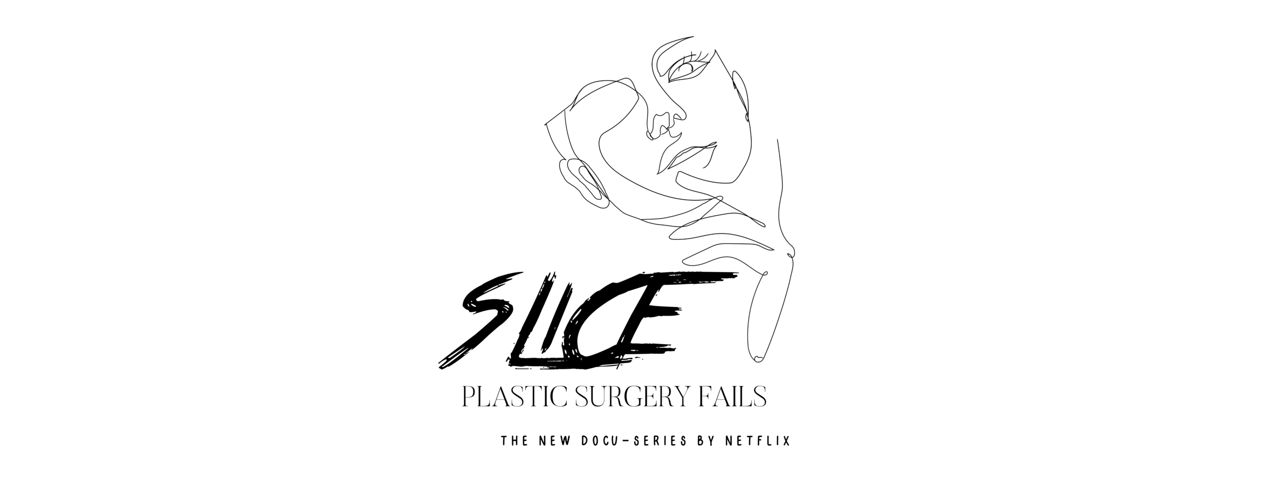
I can also see this as the logo for a plastic surgery fails documentary. LOL.
As we can clearly see, when well-selected fonts are chosen, the first glance and first impression will determine if the viewer swipes left or right. This reminds me, I want to take a moment to talk about trends. There’s nothing wrong with following a trend - it’s what we do all day long in pretty much any other industry. What matters is that you land somewhere that’s relevant (AKA not out of touch), yet clearly and boldly YOU. It can be tempting to recreate the latest trending look with your spin on it, but I want to challenge all of us to dig deeper and to be an original, authentic voice, instead of the echo of someone else’s brainchild. Trends are trendy and gain popularity for a reason. They work. They’re eye-catching, often tell a story and have substance. But if you don’t know why you’re using that trend to communicate your message, your message won’t resonate. If the trend doesn’t tell your brand story, everything will feel chaotic and you won’t build any trust with your viewers or your clients.
I knew for a long time that I wanted my IG feed to be a collage. This was a trend I was ok with putting my own spin on because I wanted the main purpose of my feed to be a lookbook, and it was important to me that everything felt very cohesive. This is an example of me following a trend, making it my own, and knowing how I wanted to use that trend to further my message. I knew I wanted my feed to be a place where clients and other lash artists alike could quickly glance at to be validated - not convinced - that my brand is real and reliable. Jamie Butler (@lashbase_jamie) said it really well, “Word of mouth and great customer service are the 2 keys to growing your business and social media can then simply supplement it.”
I wanted my social media to communicate what you might feel if you work with me. I didn’t want it to be a place where I would try to find clients, but a place where I could build on already-established relationships, interact with this beautiful lash community and update my Stories with fun things or important news.
It’s imperative that you have a vision for what you want something to be before you jump into it.
““IF YOU DON’T HAVE A VISION, YOU’RE GOING TO BE STUCK IN WHAT YOU KNOW. AND THE ONLY THING YOU KNOW IS WHAT YOU’VE ALREADY SEEN.””
Are you having a hard time with your vision? Or are you having a hard time executing it? The execution is always the hardest part for me. DM me on IG or leave a comment and let me know!


